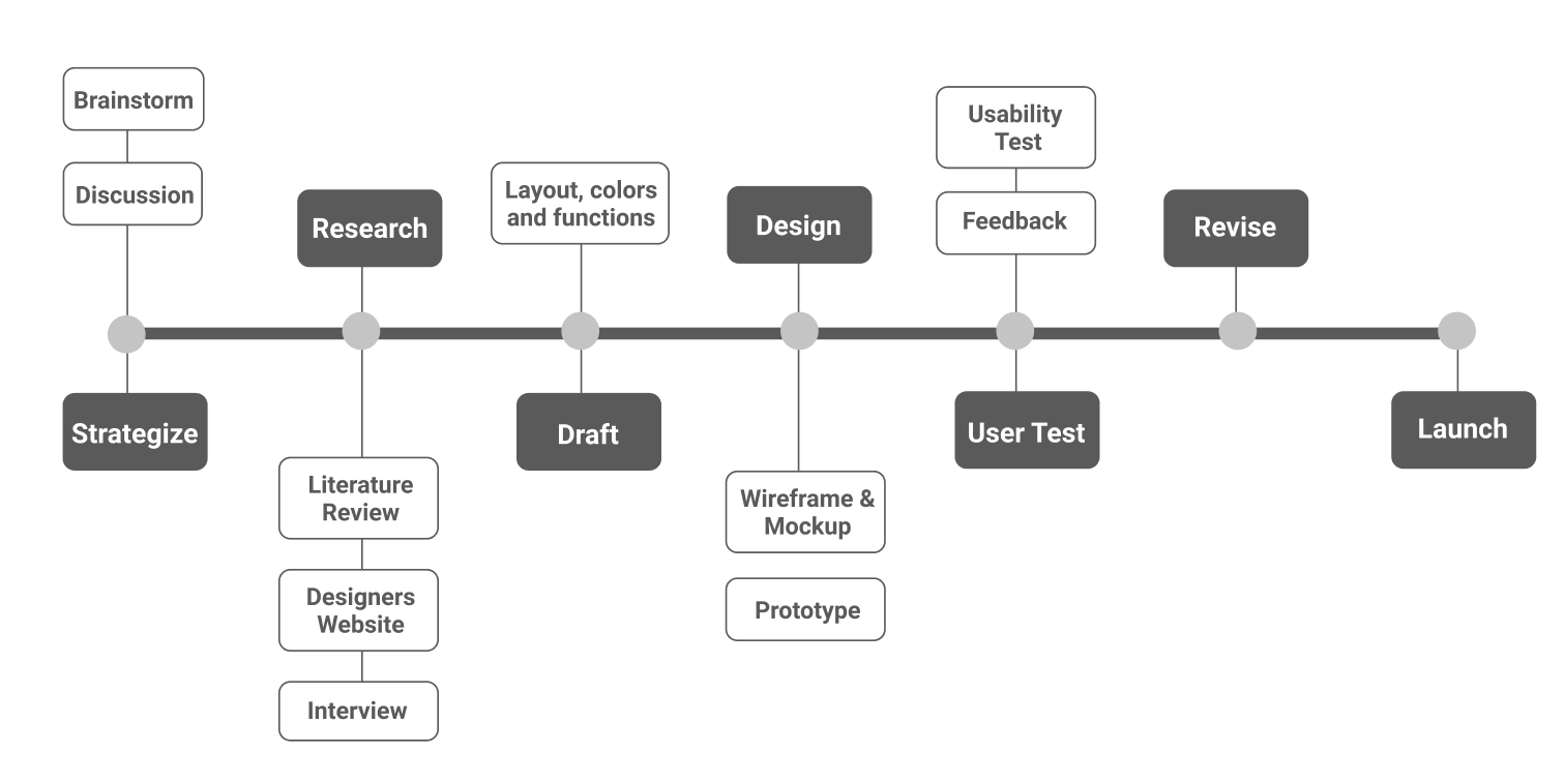
Since I already have a master degree in journalism and worked as a journalist, I want to demonstrate how fake news penetrates into our daily lives and even influence our attitude toward health, politics and civic engagement. Since it's an information-oriented website, I want it to be intriguing and informative. I spent a lot of time exploring many media literacy websites and landing page design websites for reference. I also did a lot of literature review to narrow down the information I want to present in the site. Moreover, because I want to show users how different places are affected by fake news, I also want to visualize database I've found in literature review.
The design inspiration can be categorized into my personal interest and visual inspiration. For recent years, people have seen how fake news or misinformation become information weapon to manipulate people's political attitude and election results. Moreover, V-Dem (Varieties of Democracy) research project led by the University of Gothenburg produces the largest global dataset on democracy, and the results showed Taiwan was found to be exposed to misleading viewpoints or false information disseminated by foreign governments. For example, Taiwan legalized same-sex marriage this year but some older people still received misinformation about LGBTQ groups from Facebook, and Line, which led to their resent towards these groups.
We've seen people get hurt, bullied and even kill themselves because of some fake news with sensational titles which cater to certain political or economic interests. I want users to feel it's important to to identify fake news and how to cope with it.
.gif)
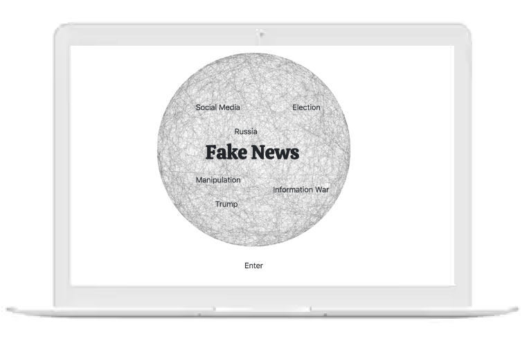
The index is more like a metaphor to depict the spread of fake news as a giant net. Countries, politicians, social media and netizens are intertwined together. The texts appear on the web alternatively because I want users to feel curious or empathize with the words showing up.
In the beginning, I imagined that I could embed Hoaxy API and show users how fake news is spread. However, I found I need to download both the backend codes and frontend codes which will be really difficult for a novice designer like me. So I chose to borrow the template codes from p5.js to build an entangled net as a metaphor.
It's not enough if I want to show how different agents are intertwined together within this net, so I use animation keyframes to make texts appear alternatively.


It is the main page for presenting information about fake news. And I tried to use parallax scrolling effect to make my website more interesting and accessible. I embedded skrollr CDN and customized my own html with changes I'd like to make. At the bottom of this webpage, I used javascript to store the data flow, trying to create more interaction and engagement.
.gif)
.gif)
.gif)
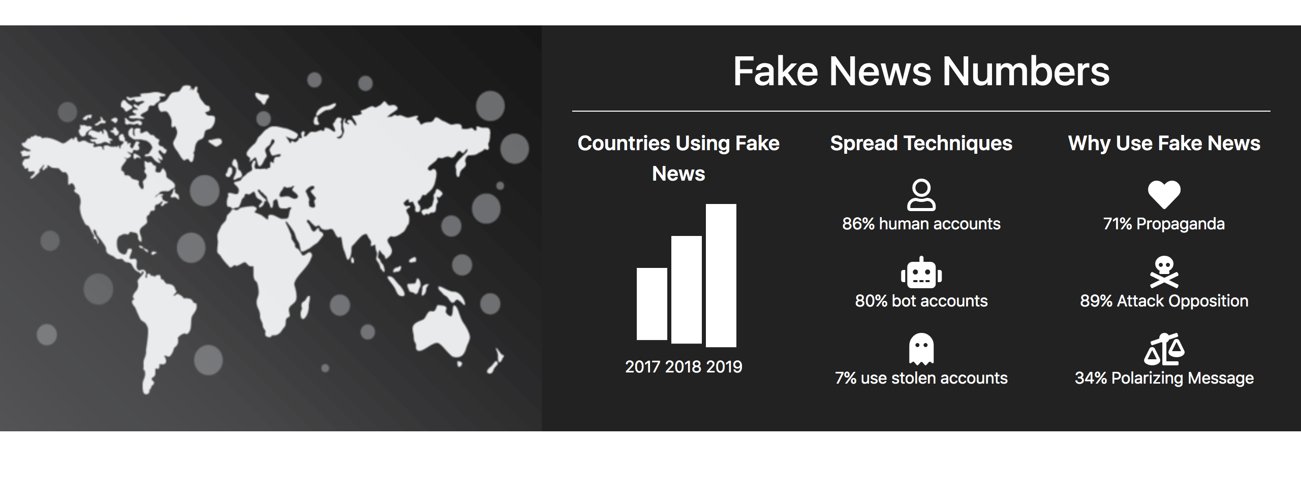
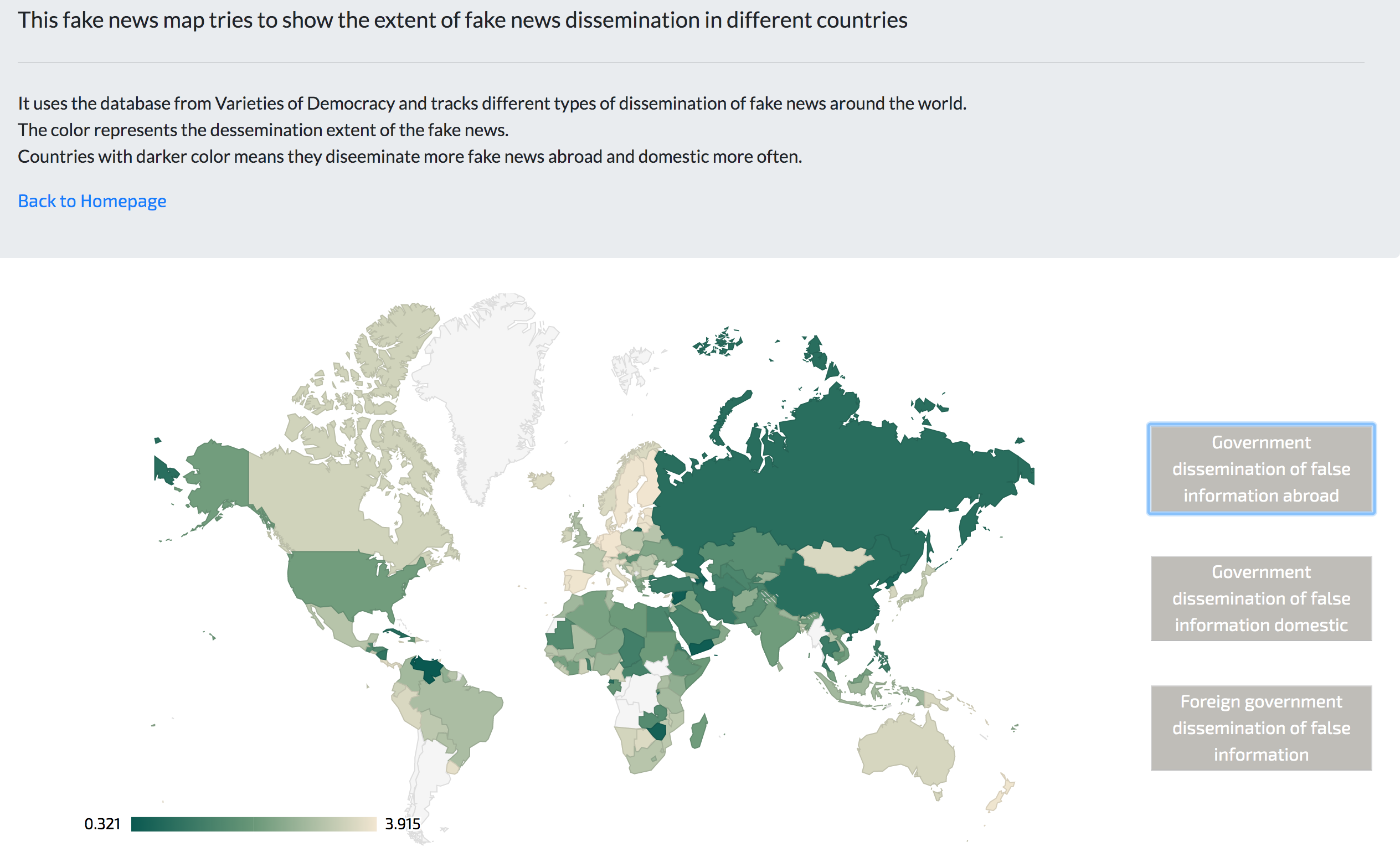
There's much research about fake news so I have a lot of data to work on. With so much data and report, I think the best way to utilize these data is to visualize the spread of fake news. As a result, I designed an interactive map which showed different extents of the dissemination of fake news.
There are three types of dissemination. One is to identify which country disseminate fake news to foreign countries. One is to show which country disseminate most fake news in its own country. If one country has deeper color than other countries, it means that country is under fake news attack from foreign governments.